Bet screen overhaul
User Research, Interaction, Visual Design, Prototyping & Testing

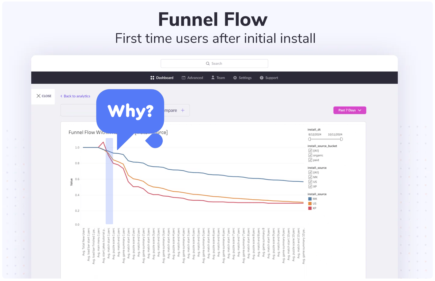
Main questions asked:
- How much do you like or dislike the way the bet selection screen looks and is laid out in Bingo Pop / Bingo Blitz
- Is there anything confusing about what you see on the bet selection screen?
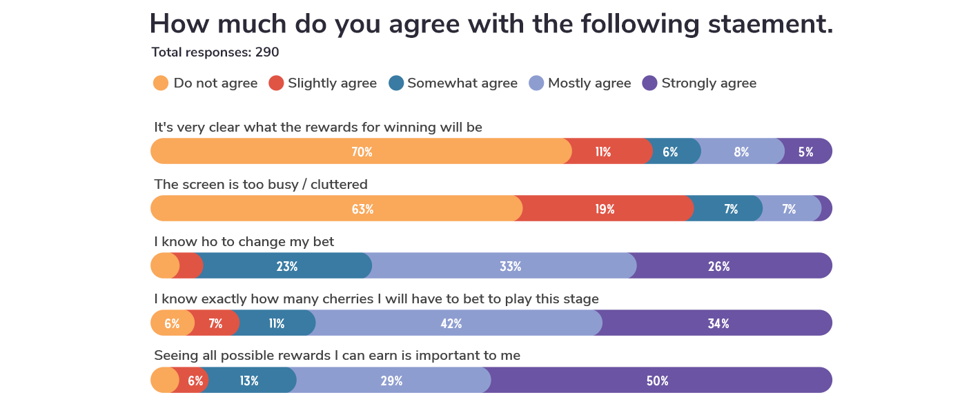
- How much do you agree with the following statement.
- It's very clear what the rewards for winning will be
- The screen is too busy / cluttered
- I know ho to change my bet
- I know exactly how many cherries I will have to bet to play this stage
- Seeing all possible rewards I can earn is important to me
- How much do you like or dislike the way the bet screen looks and is laid out in Bingo Blitz.


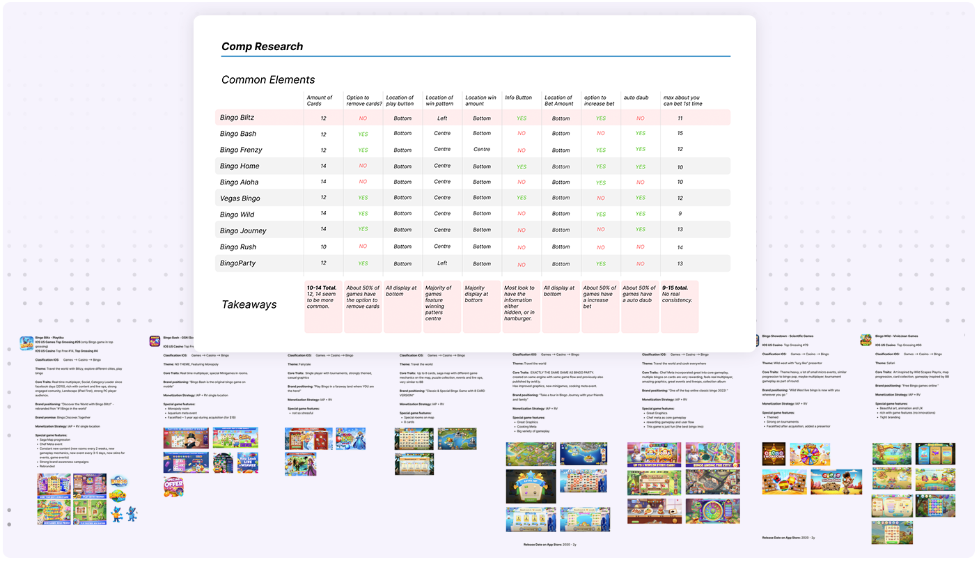
I conducted a thorough analysis of the bet screens from 10 of our top competitors, carefully examining their visual attributes, item positioning, and functional elements. By breaking down each screen, I was able to spot common design patterns and the features that seemed to pop up everywhere—like the bet amounts, reward displays, and those all-important interactive buttons. This gave me a treasure trove of insights into what users actually engaged with the most. Armed with these findings, I was able to suggest design improvements for our own bet screen, ensuring it not only met industry standards but also didn’t make users feel like they were playing a game of "Where’s Waldo?" just to place a bet.

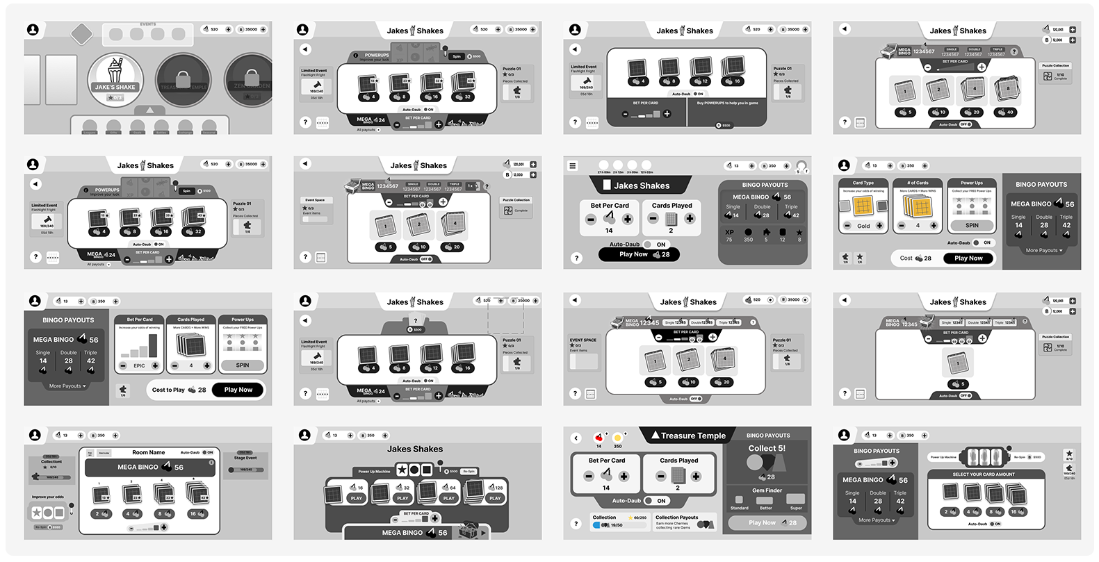
I developed several iterations of the bet screen, experimenting with different layouts and features to find the winning formula. After refining these versions, we landed on the one you see below. One of the key updates was moving the "Power Ups" feature directly onto the bet screen—a feature we usually introduce later. By adding it upfront, we hoped to eliminate an extra step and let players dive into the game faster, without feeling like they were jumping through hoops. We then prototyped this version, making sure the "Power Ups" were seamlessly integrated, so users could engage with the game more quickly
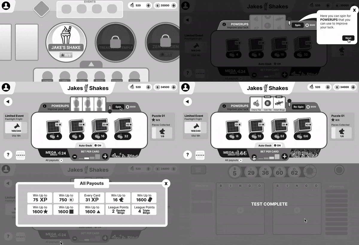

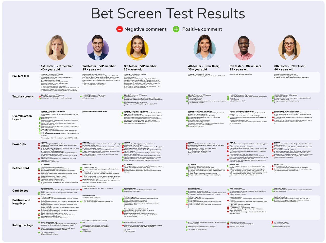
On the Positive :
- Users appreciated the new layout, mentioning that it felt less overwhelming than the previous design.
- The new First-Time User Experience (FTUE) screens were particularly successful in preparing users for what to expect, guiding them through the initial steps smoothly.
- Users had no trouble understanding how to select cards and adjust their bet amounts, suggesting that the core mechanics of the screen were clear and intuitive.
On the Negative:
- Users found it difficult to understand the "Power Ups" and how they functioned within the context of the game.
- There was a clear need for more information or guidance on the powerups to help users make informed decisions.
- The placement of the bet meter below the card selection caused confusion, as users felt it was out of sync with the game’s flow—since selecting cards was the starting point of the game, having the bet meter positioned further down felt odd to many.
This initial round of testing provided valuable insights that would help refine the design further, particularly around the powerup feature and the layout of the bet meter.
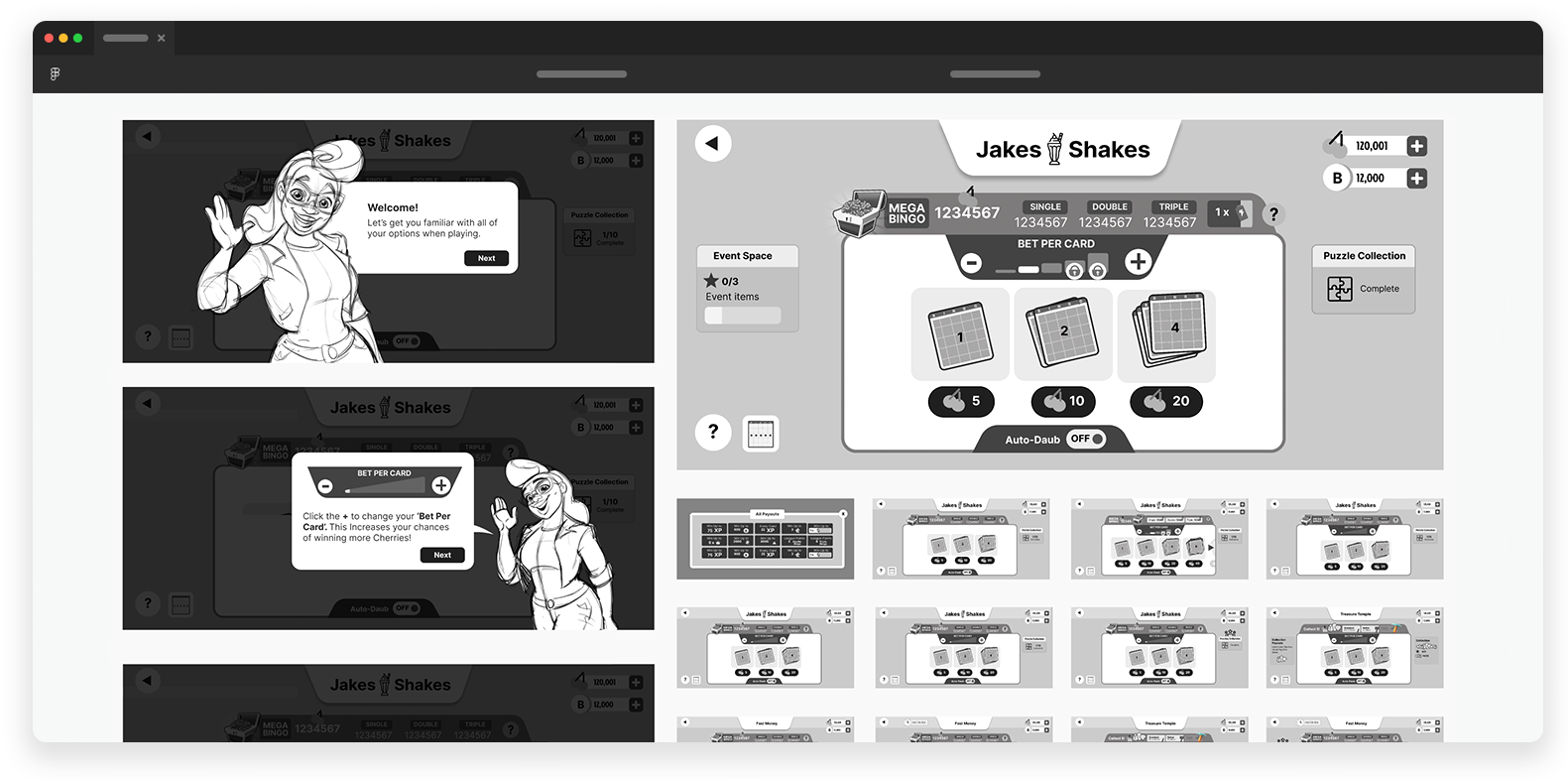
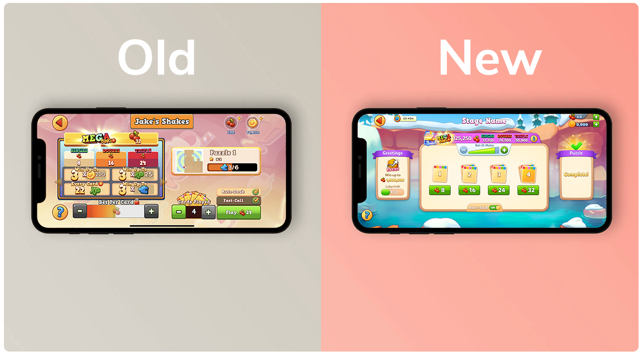

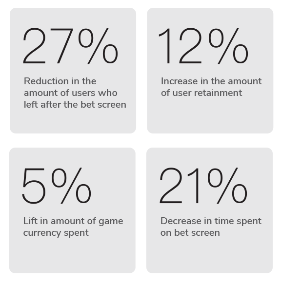
We ran a limited test with 5% of live users, and the results were promising—a 27% drop in users bailing after the bet screen! We’re still iterating and making improvements, because hey, even good things can get better!
