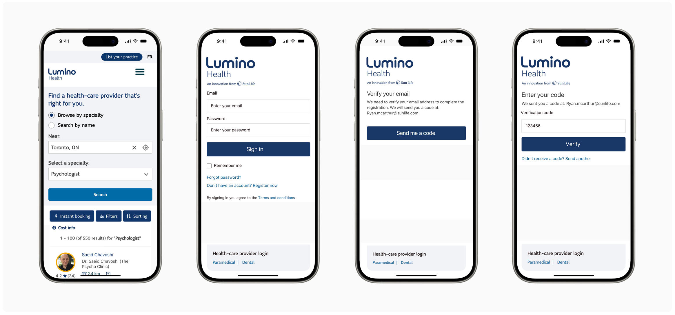
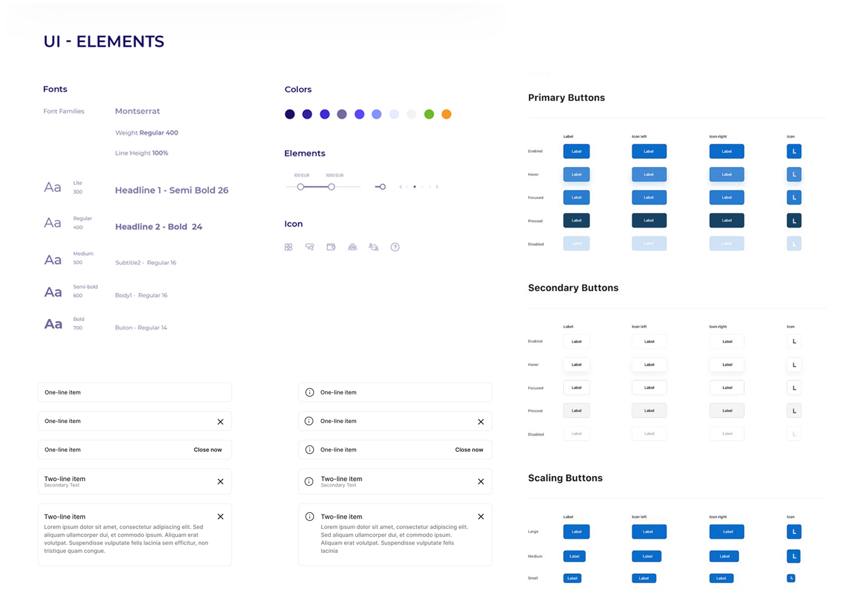
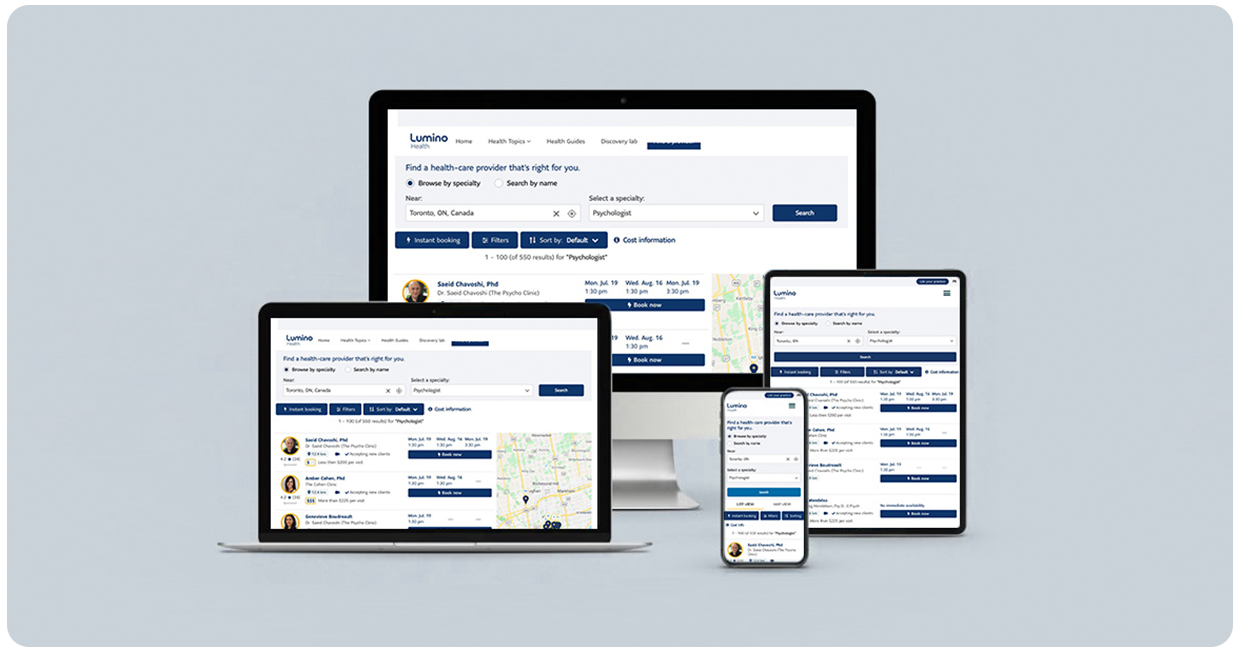
User Research, Conceptualization, Interaction, Visual Design, Prototyping & Testing


Using a Lean Canvas was like putting on a pair of super-powered glasses that helped me spot the glaring issues with Lumino Health’s login and registration flow. Here’s how I tackled it:
- Articulated core user problems in existing registration booking sites:
- Confusion during registration
- High abandonment rates
- Difficulty logging in
- Identified customer segments, including:
- Busy Parents
- Older adults
- Younger millennials
- Mapped out potential solutions, unique value propositions, and key success metrics.
- Gained comprehensive understanding of the landscape.
- Enhance user experience and informing strategy.

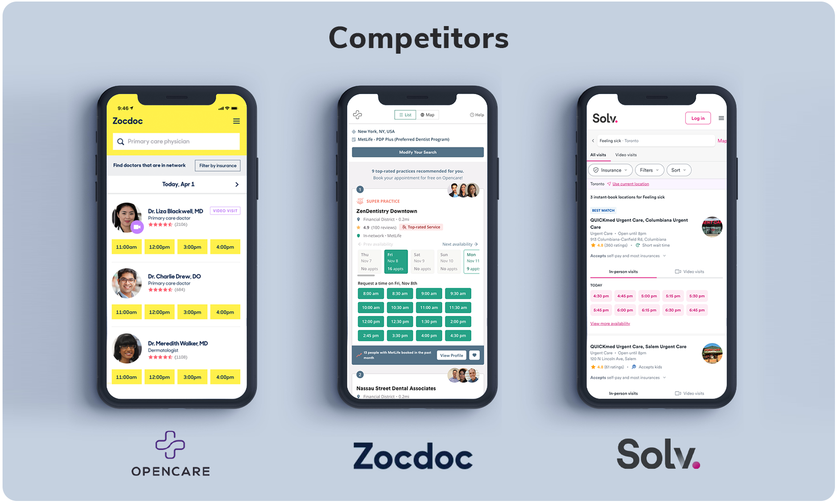
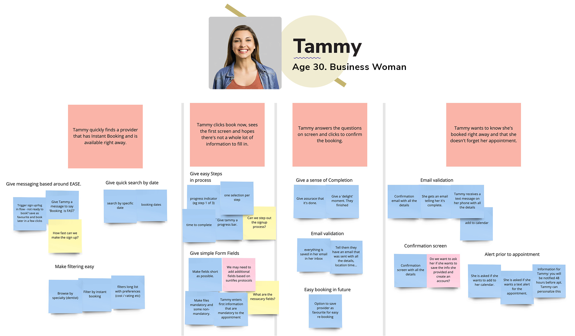
I dove into competitor analysis to see what healthcare platforms were doing right (and, mostly, what they were doing wrong). I found endless forms, confusing registration flows, and way too many “are you sure?” pop-ups. With that treasure trove of pain points, I crafted a smoother, faster registration flow for Lumino Health that not only met industry standards but actually made users say, “That was easy!”
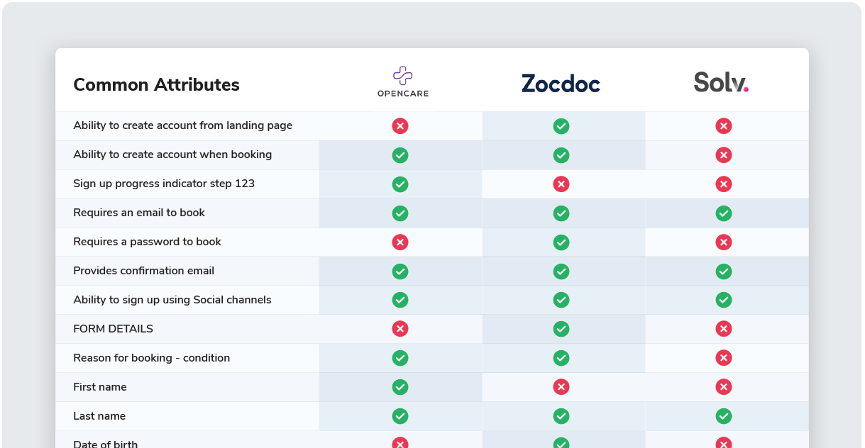
I tested competitors' registration processes with real users to see what made them cringe and what made them cheer. By watching their navigation misadventures and listening to their grumbles, I pinpointed the design elements that users actually liked (yes, those do exist) and used that intel to refine Lumino Health’s registration flow.
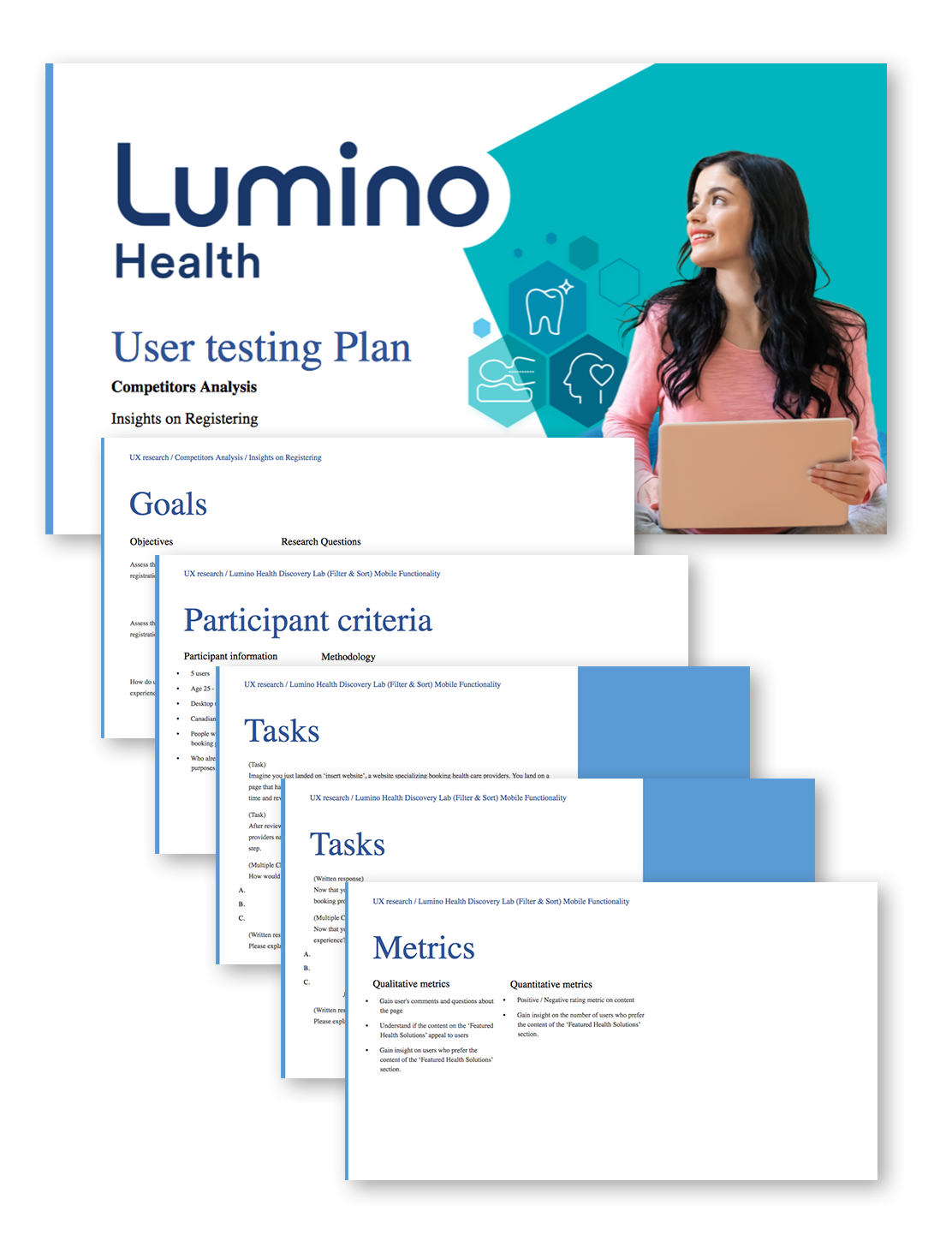
For the usability test, I teamed up with Usertesting.com. Participants were thrown into live competitor registration flows, asked to perform tasks, and then grilled about their thoughts, expectations, and general level of frustration.
Participant information:
- 5 users
- Age 25-50
- Desktop users
- Canadians with extended health coverage
- People who have used appointment booking platforms
- Who already use sites for health content purposes.
Qualitative metrics
- Gain user's feedback on the overall look and feel of typical registration flows.
- Understand if the content on typical registration flows appeal to users.
- Gain insight on the time in which it takes a user to complete a typical registration flow.
Quantitative metrics
- Positive / Negative rating metric on typical registration flows
- Gain insight on the number of users who prefer the content during typical registration flows.
- Detail to amount of time it takes a user to complete a typical registration flow.


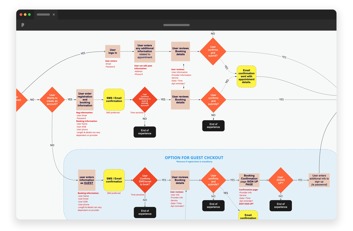
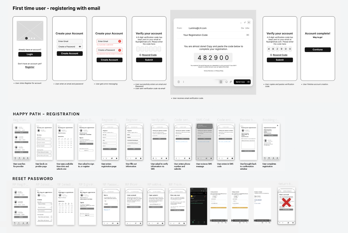
Key stages of the user flow included:
-
Appointment Type Selection: Analyzing how users choose between different types of appointments based on their needs, ensuring clear options and an intuitive decision-making process.
-
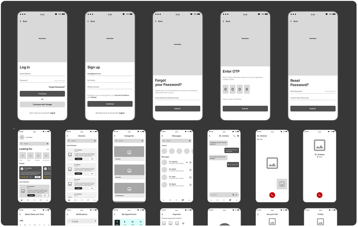
Registration Process: Breaking down the steps users take to input personal information, verify details, and confirm their identity, while minimizing friction and enhancing clarity.
-
Appointment Booked Dashboard: Designing a clear, easy-to-navigate dashboard that confirms the appointment, provides next steps, and allows users to modify or cancel their booking if needed.
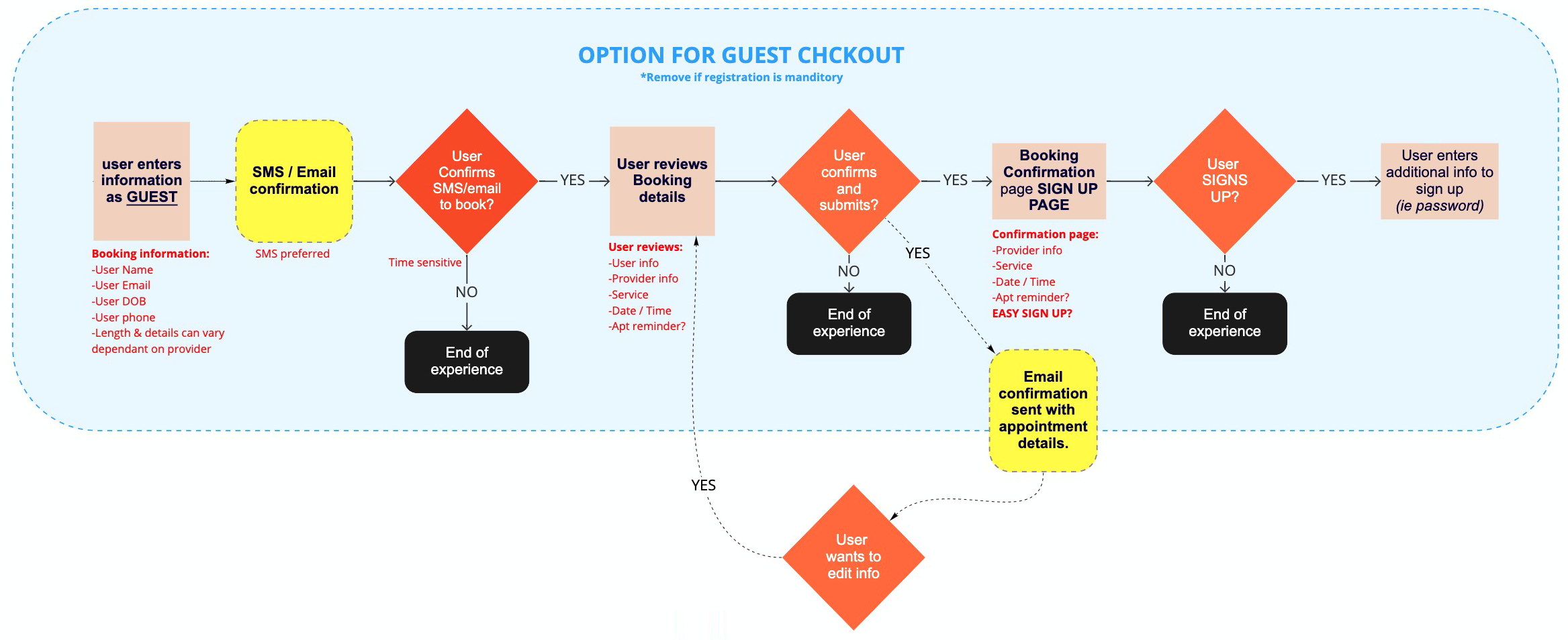


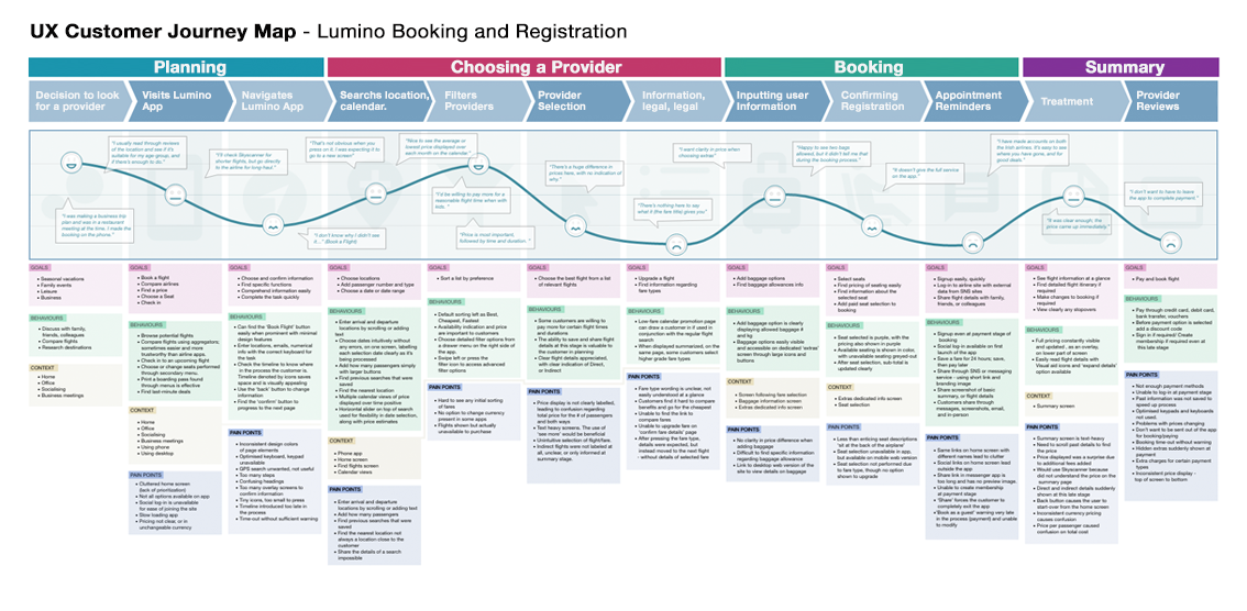
User Phases:
- Planning Phase – Users research options, gather information, and searches products to make an appointment, user find Lumino.
- Choosing a Provider Phase – Users explores Lumino, browses available providers, filters, compare offerings, and weigh their preferences.
- Booking a Provider Phase – Users select a provider, registers, choose exact times, confirm their appointment details, check for accuracy, sets alert and finalize the process.
- Summary Phase – Users receive alerts, user sees provider, user rates and reviews.
