UI Design, User Research, Interaction, Visual Design

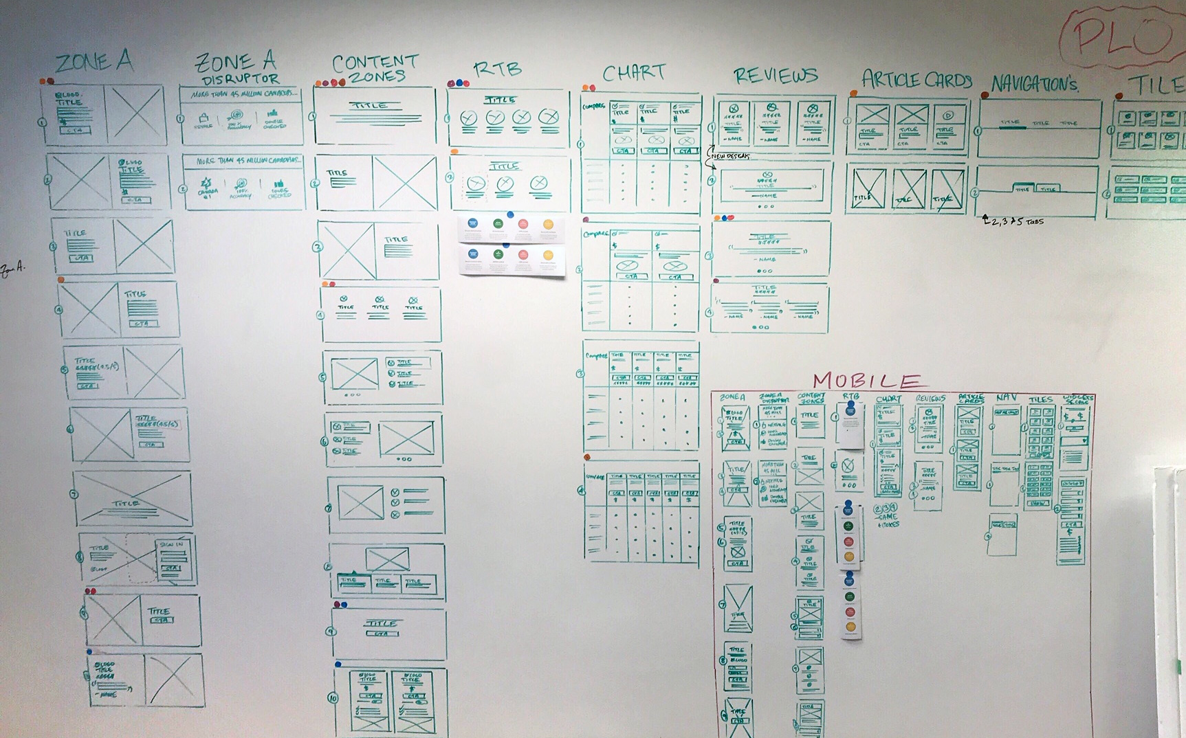
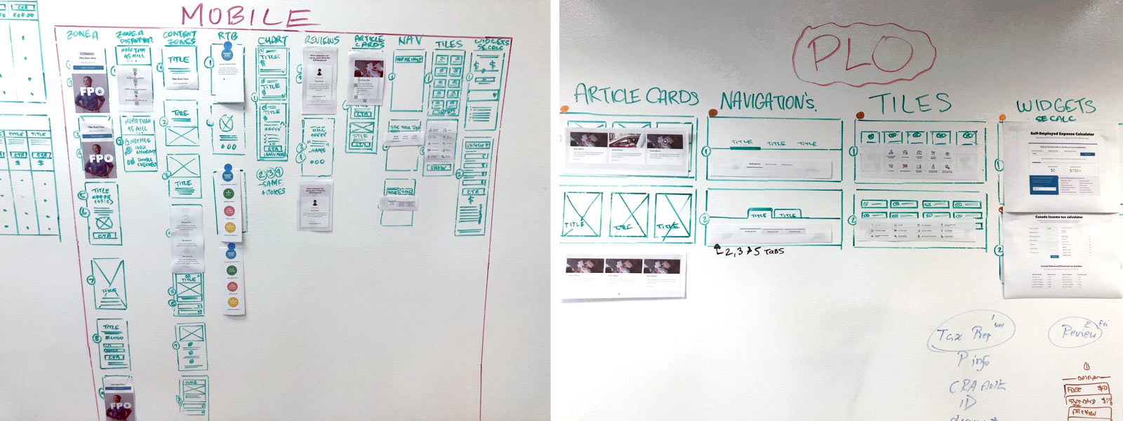
I designed over 100 components for TurboTax.ca, meticulously whiteboarding and mapping each element across the site. From headers and zones to titles, content blocks, customer review sections, and navigation elements, every piece of content was thoughtfully considered. This meticulous approach ensured that nothing was overlooked, and each component integrated seamlessly into the new system.
I conducted a thorough audit of each section of the website, analyzing its relevance, performance, and alignment with user needs. The process involved:
- Assessing Usage: I reviewed data and traffic patterns to determine if each component was still actively used or had become outdated.
- Identifying Opportunities: For sections that were underperforming, I explored ways to enhance functionality, usability, or design to better serve the user.
- Evaluating Value: I measured the importance of each component from the customer’s perspective, ensuring that high-value elements were prioritized and optimized.
Any components that no longer served a purpose were discarded, while others were refined and reshaped to better align with user needs and improve the overall experience. This iterative process ensured the site remained lean, relevant, and customer-focused.

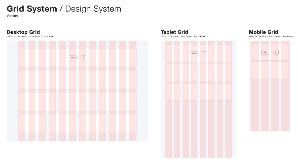
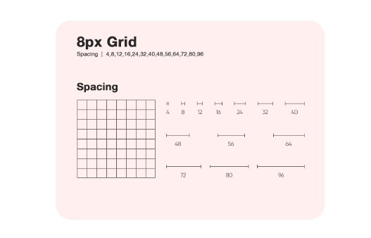
The first task was building the foundation with page templates. I explored various approaches to organizing information, navigation, and content. Collaborating with front-end engineers, we aligned on grid breakpoints for desktop, tablet, and mobile to ensure a consistent experience across all devices. Using an 8px grid to keep spacing and element sizes consistent, helped make the design scalable across devices and screens. It simplified decisions, ensured alignment, and gave the layout a clean, polished look throughout the project.

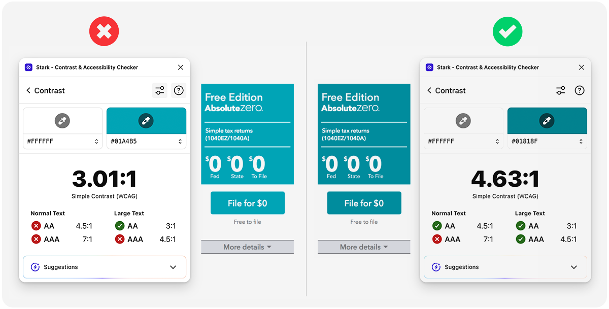
The next phase was building an evolving set of components. First an formost I wanted to examine the accessibility of all TurboTax's current buttons and text styles to ensure they met at least AA compliance standards. This involved reviewing contrast ratios, font sizes, and readability, and making any necessary adjustments to ensure accessibility for all users.
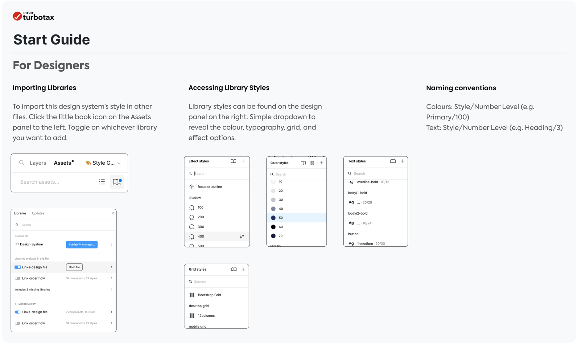
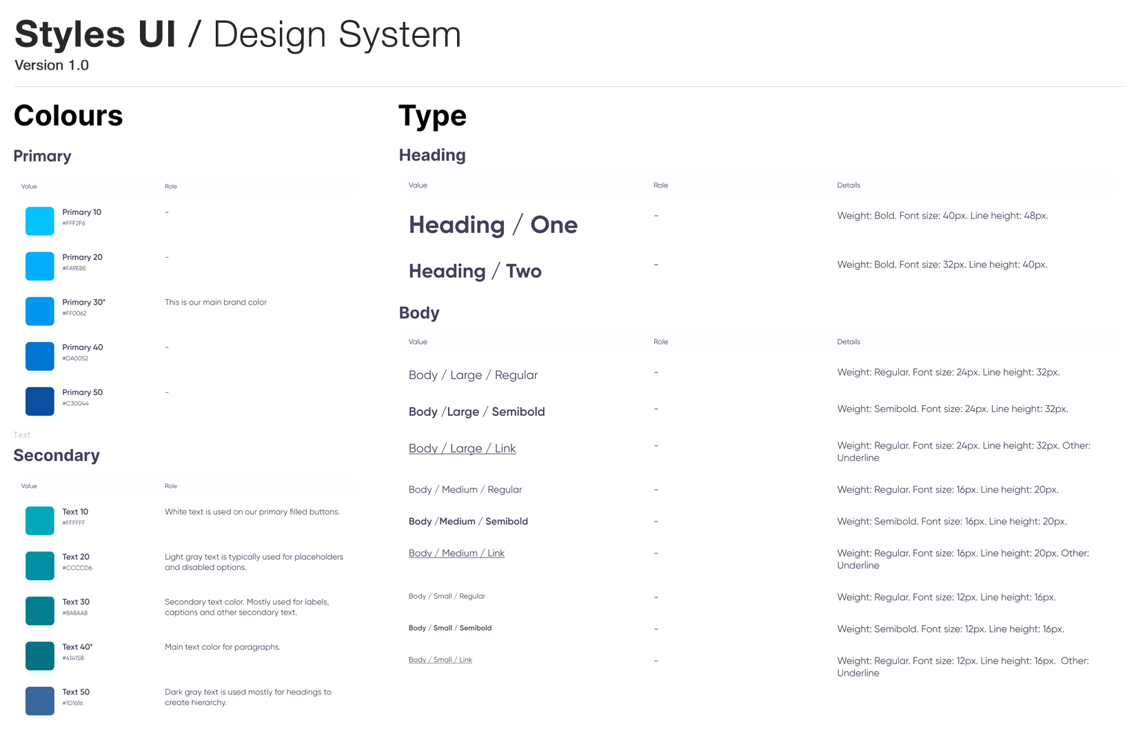
The next phase was building an evolving set of components. Working closely with the development team, we ensured that naming conventions and component organization were aligned for both design and development needs. A Design System thrives on collaboration, and I wanted to make sure that every component we created was easy for the entire team to use and maintain.
I wanted the component library to be organized with clear naming and grouped frames. I used semantic layers and variables for easy updates and consistency. Key components like buttons, nav, and forms were built with all every state required. Setting clear Primative, and Primary components made scaling and collaboration simple.
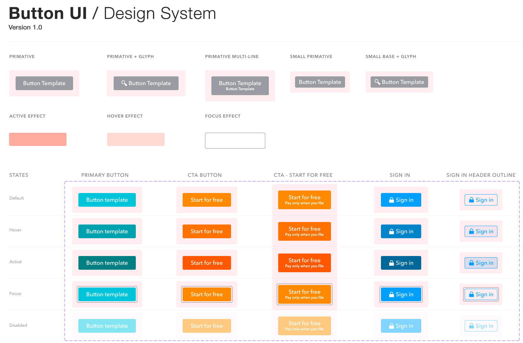
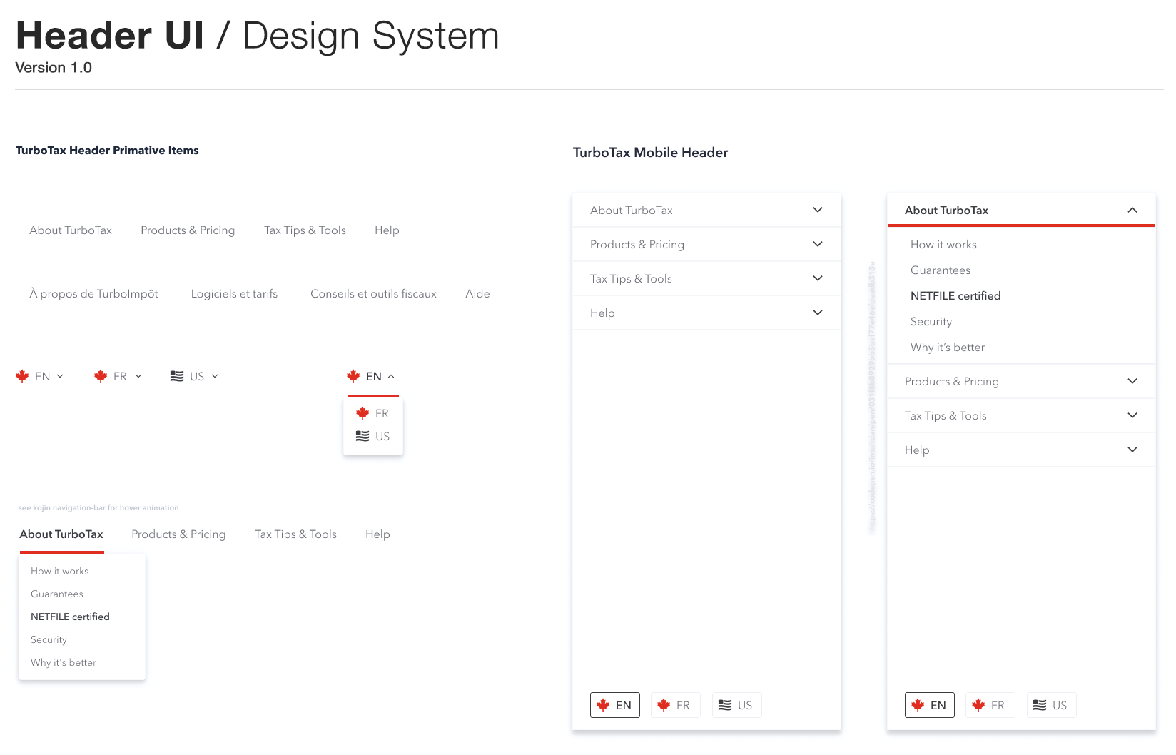
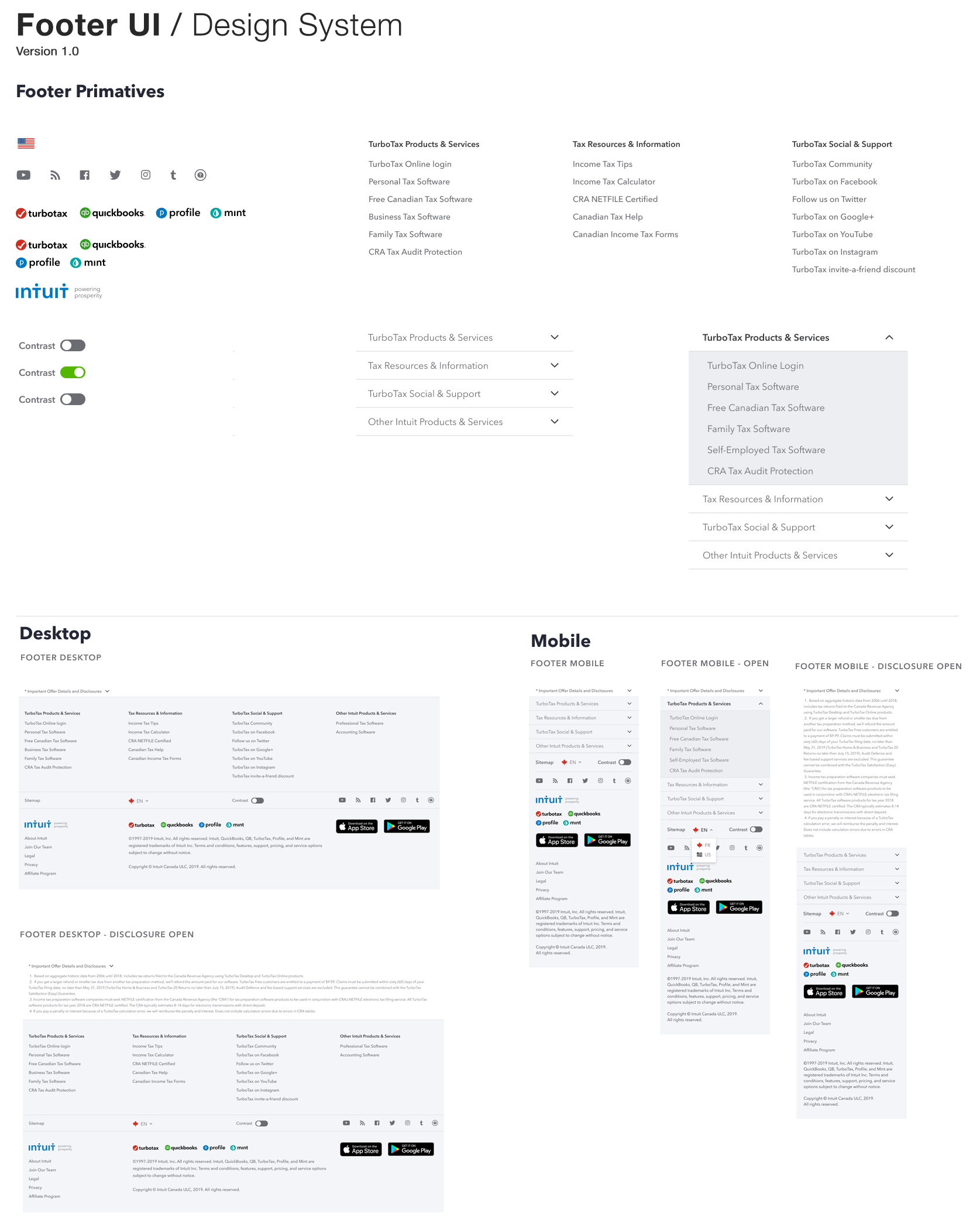

I kept it simple – Figma notes, walkthroughs for tricky flows, and visual guides. When new components dropped, I linked them straight to the screens, keeping devs connected to the source of truth without extra docs to dig through.
