HMC tile design

Role
Sr. UX/UI Designer | Intuit
User Research, Interaction, Visual Design, Prototyping & Testing
Overview
TurboTax’s "Help Me Choose" (HMC) page is like a friendly guide that helps users find the perfect product based on their unique needs. It’s a key part of making the onboarding process quick and easy, so users can jump straight into the right product and start filing without the hassle—think of it as their personal tax concierge, minus the bow tie!
Boost engagement and make users trust our recommendations.
Problem
The PLU page on TurboTax.ca has lower user engagement, with only 50% of users interacting with the "Help Me Choose" tiles, compared to 70% on TurboTax.com. Plus, many users aren’t following the tile recommendations. How can we encourage more interaction, help guide users to the right product more effectively, and ultimately boost conversion and engagement on the PLU page?
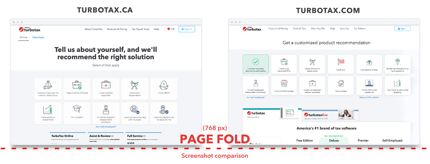
Comparing Canadian site to US
Problem Solving
I noticed that tile interactions are 20% higher in the US compared to Canada, so I took a closer look at both PLU pages to see what might be different. After comparing the screenshots, it was clear that the content above the page fold varies a lot between the two sites. In fact, 42.1% of users on TurboTax.ca aren’t seeing content below the 768px fold, which could be affecting their engagement.

Key takeaways:

1. Addressing the page fold: If I can improve the visibility of content above the page fold, it could increase tile interactions by ensuring more content is immediately accessible to users.

2. Reimagining the tile design: Rethinking how the tiles are presented might encourage greater user engagement, leading to more product interactions and an increase in product starts.

In summary, optimizing the page fold and redesigning the tile layout could drive higher user engagement and boost product starts.


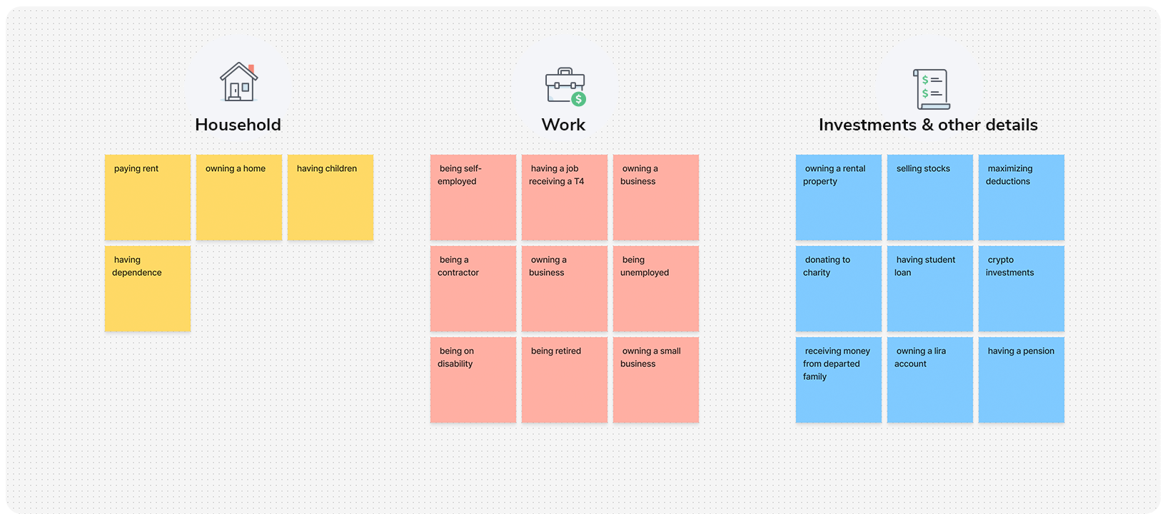
Categorize tiles - Card Sorting
Cart sorting

I took all our HMC tiles and gave them a makeover, organizing them into smart groupings that actually match the needs and preferences of our different persona types. By analyzing user behavior, pain points, and goals, I created logical categories that help users find what they’re looking for faster. For example, I grouped tiles based on user intent:

  • Household
  • Work
  • Investments

The goal was to try and ensure that each persona would see the most relevant product offerings. This had the hopes of restructuring not only improved content discoverability but also enhanced the overall user experience by reducing cognitive load and guiding users toward the most appropriate actions for their individual needs.
Qualitative interviews - A,B,C
User Testing
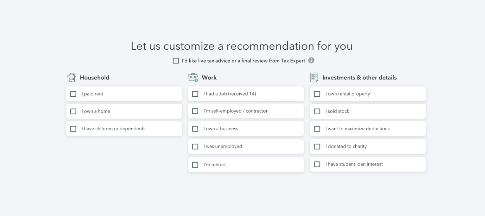
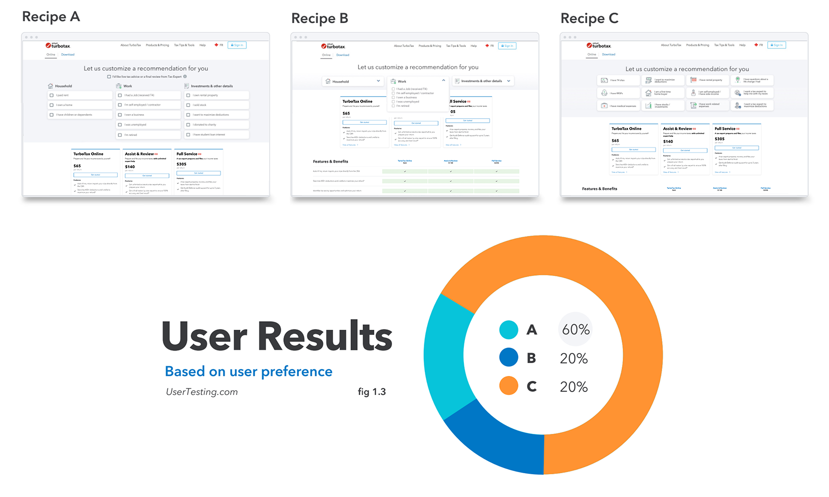
To optimize the user experience and identify the most effective layout, I created an A/B/C test with three distinct options for presenting a checklist of items. The goal was to determine which format best met user needs and preferences. Here's a breakdown of each option:

  • Option A: An itemized checklist categorized into three filters, allowing users to quickly sort and view content based on specific criteria. This approach provides clarity and organization but requires more screen space.
  • Option B: An itemized list with a dropdown tool, designed to save valuable screen space by condensing the checklist items. Users can expand and collapse sections as needed, keeping the interface clean while still offering detailed information.

  • Option C: A non-itemized, slimmer tile system with visually appealing icons, offering a more minimalist approach. This design focuses on aesthetics and quick visual recognition, prioritizing user engagement over detailed information.

By testing these three options, I aimed to assess how users interact with different types of content presentation, whether they prefer detailed organization (Option A), space-saving functionality (Option B), or a more visual, streamlined approach (Option C). This A/B/C test will help inform future design decisions and enhance the overall user experience.
Iterating on user feedback
Insights
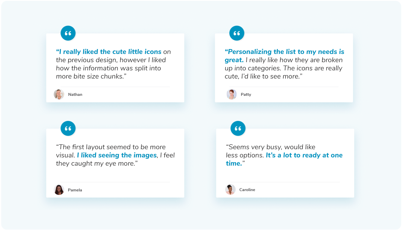
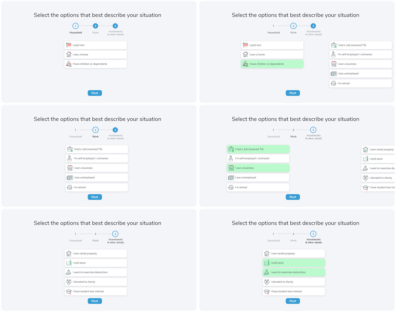
A common thread to users feedback was that theyappreciated seeing all the icons, as they made the interface feel engaging and easy to navigate. However, they also mentioned that the amount of content felt a bit overwhelming and "busy." In response, I streamlined the design by reducing the number of items displayed at once and introduced clearer visual hierarchies to help users focus on the most important information. This adjustment aimed to step out the process using 3 screens to help ease the information overload on users. Users had the choice to skip or continue using our tile selection process.
Allowing users freedom to go back
Iterating
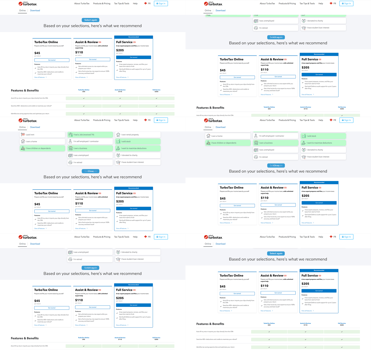
Once users select the tiles that best suit their needs, we needed a way for them to easily go back and make changes. To address this, we implemented a dropdown panel that users can open and close at their discretion, giving them the flexibility to revisit their choices without cluttering the interface. This solution ensures a seamless and user-friendly experience, allowing users to make adjustments as needed while maintaining a clean, organized layout.
Seeing Results
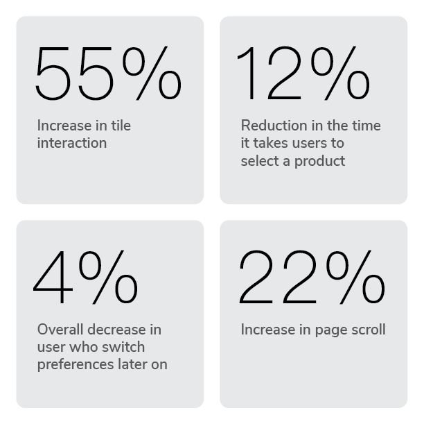
Overall stats after completion

Upon deployment, we conducted a limited test with 10% of live users. The results showed a significant boost in tile interactions and a marked improvement in overall user engagement.