Zellers Website
Role
Lead Interactive Designer | Fuel Advertising
Web Design, Visual Design, Front-end Development
Web Design, Visual Design, Front-end Development
Overview
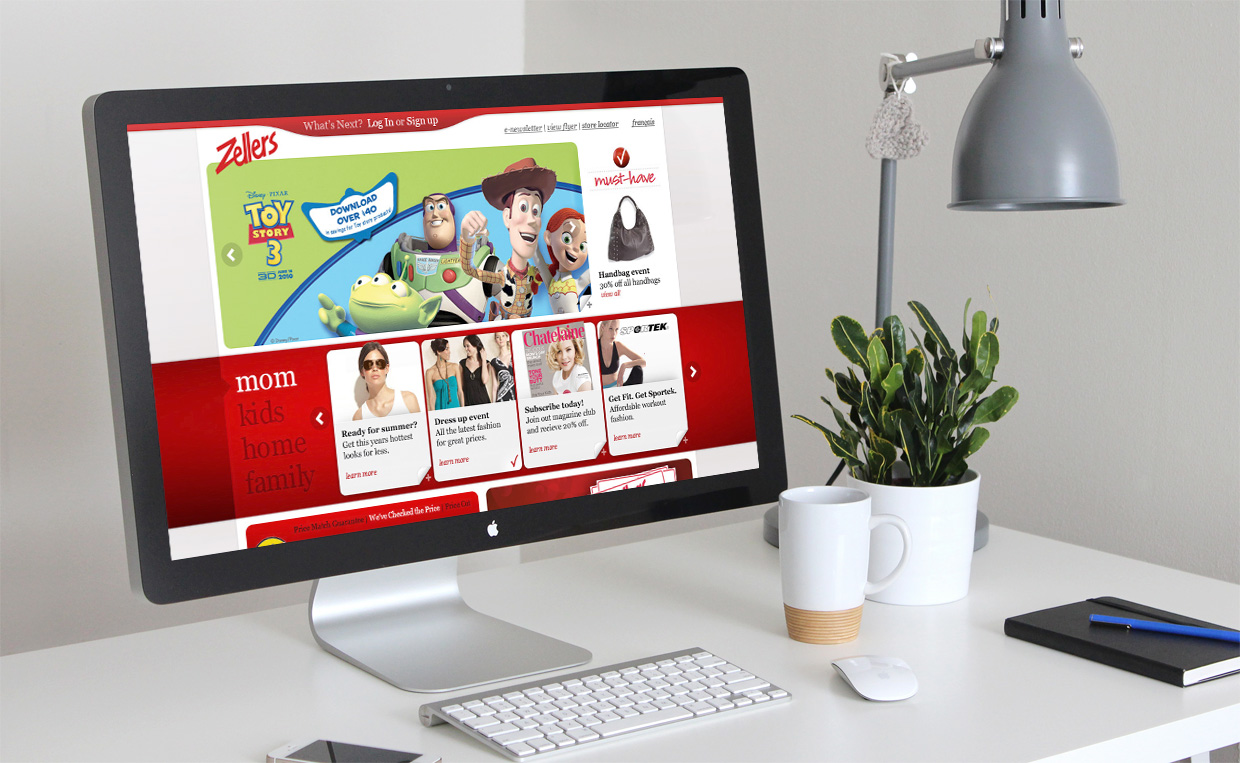
Before closing, Zellers was one of Canada's most iconic retailers. However, their budget-friendly online site was in urgent need of an overhaul. The goal was to revamp the site to drive more in-store traffic and boost overall sales.

Wireframing
Problem
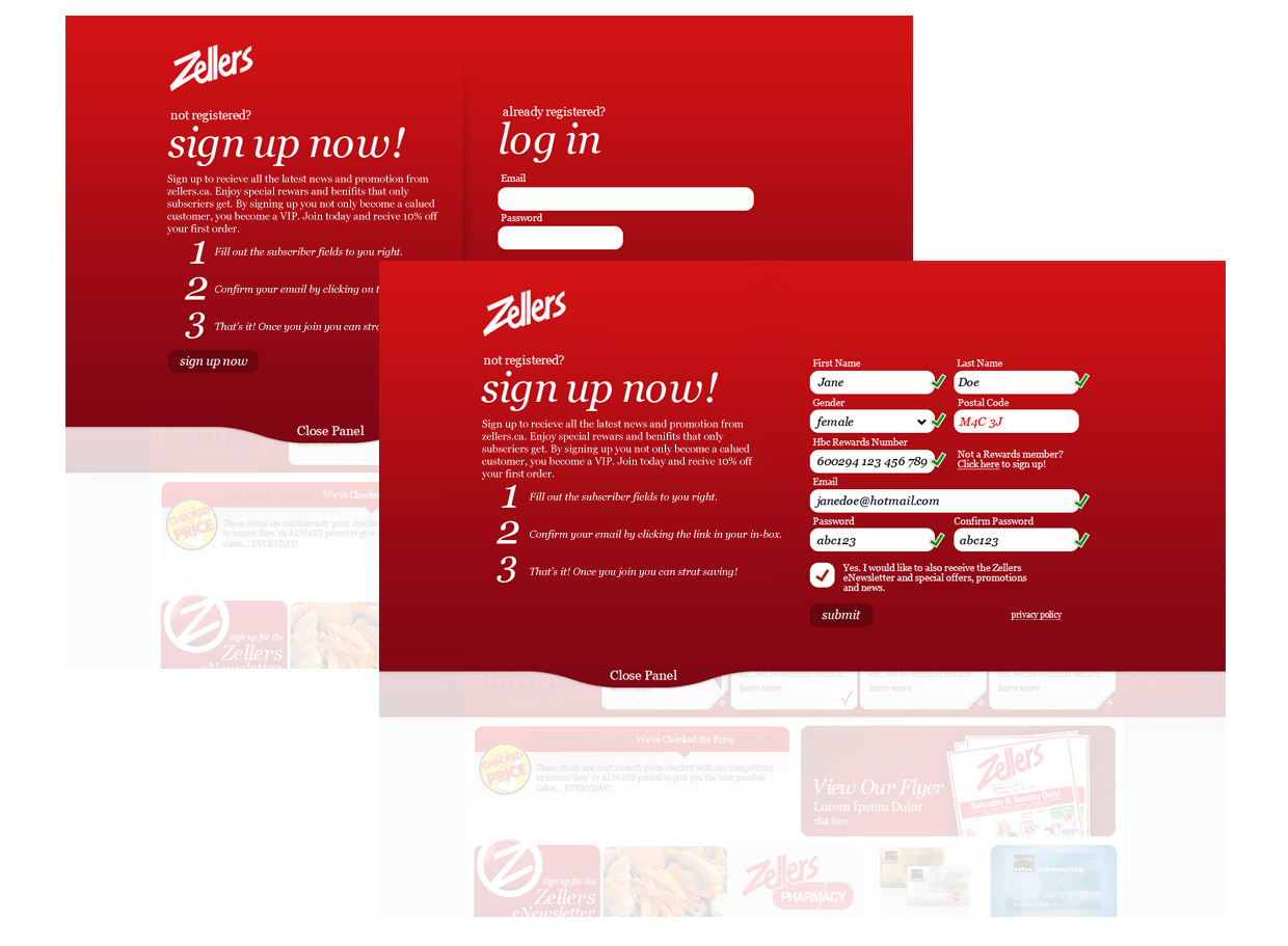
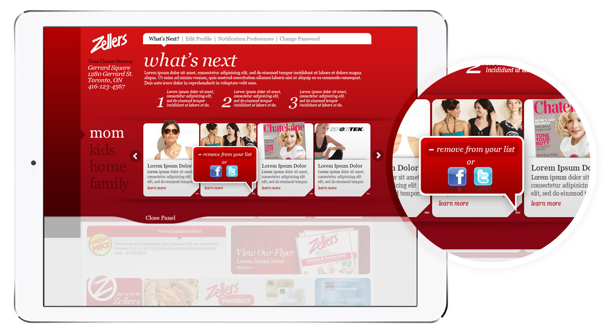
I started by researching other online retail sites and analyzing current social and interactive behaviors. Given Zellers' limited budget for full-scale e-commerce, the strategy was to encourage users to create personalized profiles on zellers.ca, where they could store their preferences and product interests. The site featured a "What's Next" panel, allowing users to curate a list of selected items and promotions. Based on these selections, they would receive personalized emails and tweets with relevant updates and offers.


Prototyping and Testing
Problem Solving
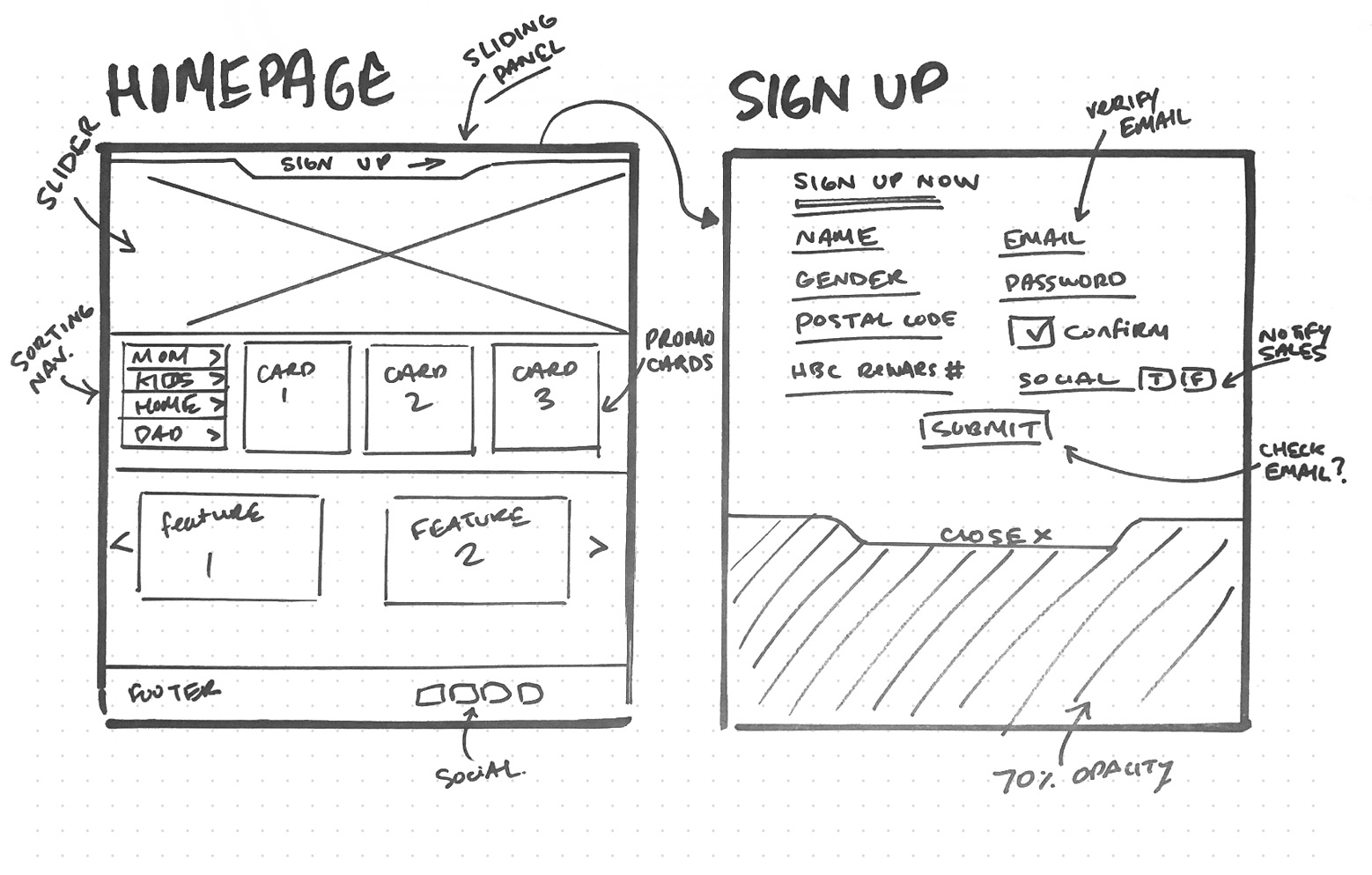
To address the complexities of the user profile page, I decided to create a quick low-fidelity prototype of the registration page to identify and resolve any potential issues. Once the flow was finalized, I conducted user tests with these low-fidelity mockups to gather feedback and refine the design.

UI Design
interaction and functioanly
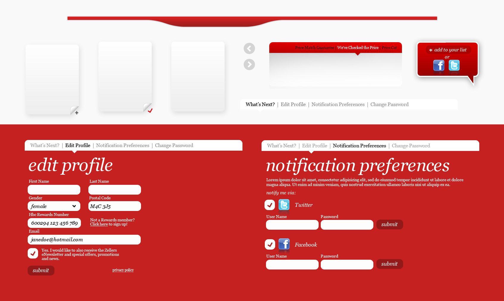
After refining the wireframing process, I began developing more polished designs, focusing on the UI details. At this stage, I was confident that the site’s functionality would be seamless, with no complications during the development phase.

Conclusion
Insights
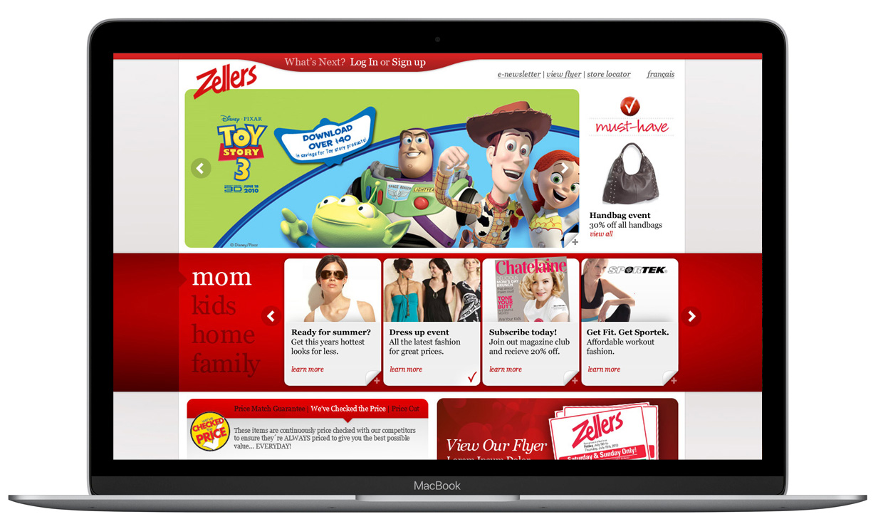
After several rounds of wireframing, testing, and prototyping, the site quickly took shape. Ultimately, the redesign helped launch a fresh new look for Zellers, driving increased customer engagement and boosting traffic to their site.
