Gift registry redesign
Role
Lead Interactive Designer | Fuel Advertising
Web Design, Visual Design, Front-end Development
Web Design, Visual Design, Front-end Development
Overview
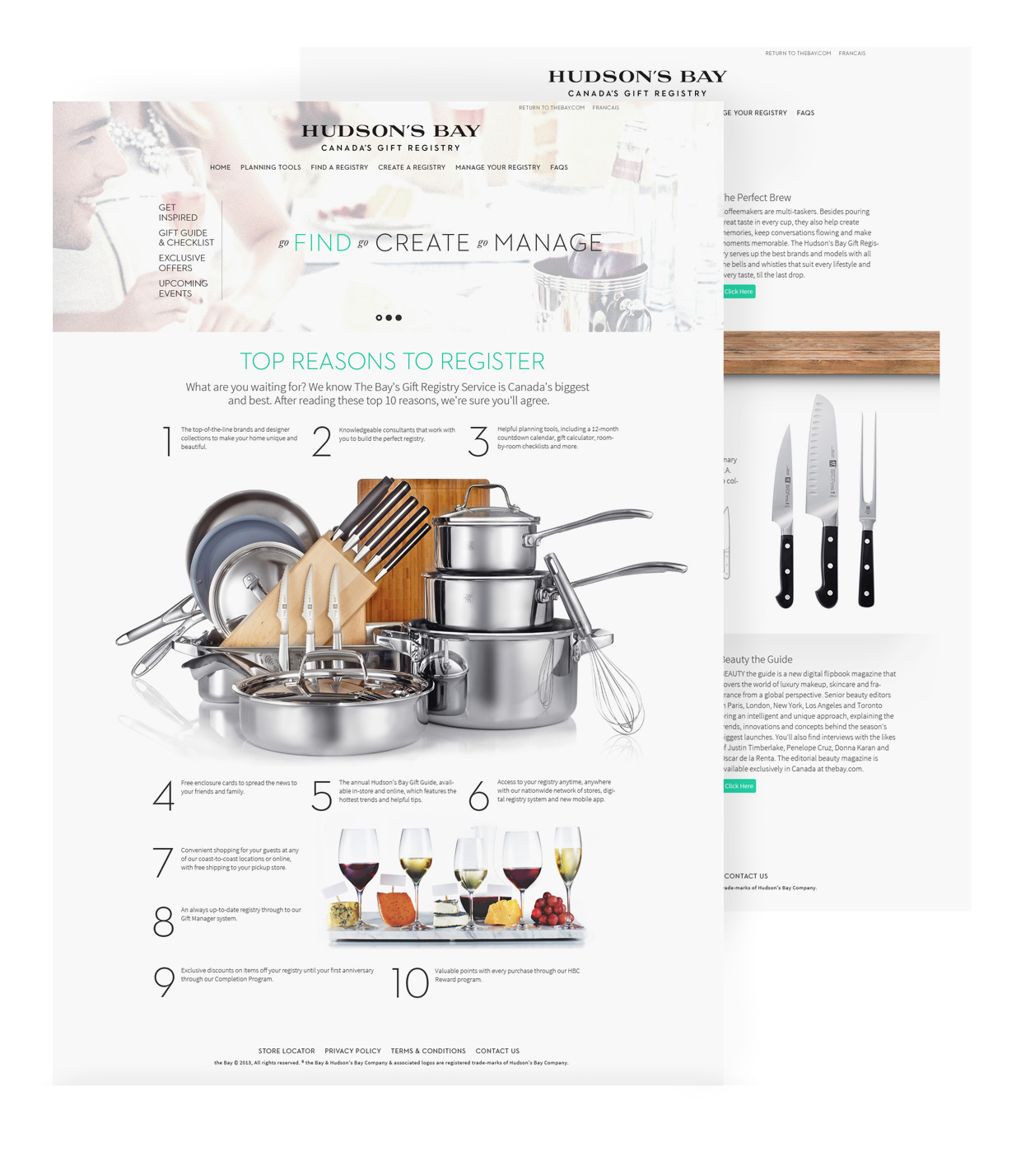
HBC's Gift Registry is one of Hudson's Bay's most popular and profitable divisions. They were in need of a total re-design of their online site. The target audience was newly engaged Canadian women ages 25-35. The site was to act as a starting point for users to register their wedding and select all the gifts they wanted to be on their registry.

Flow and Wireframing
Problem
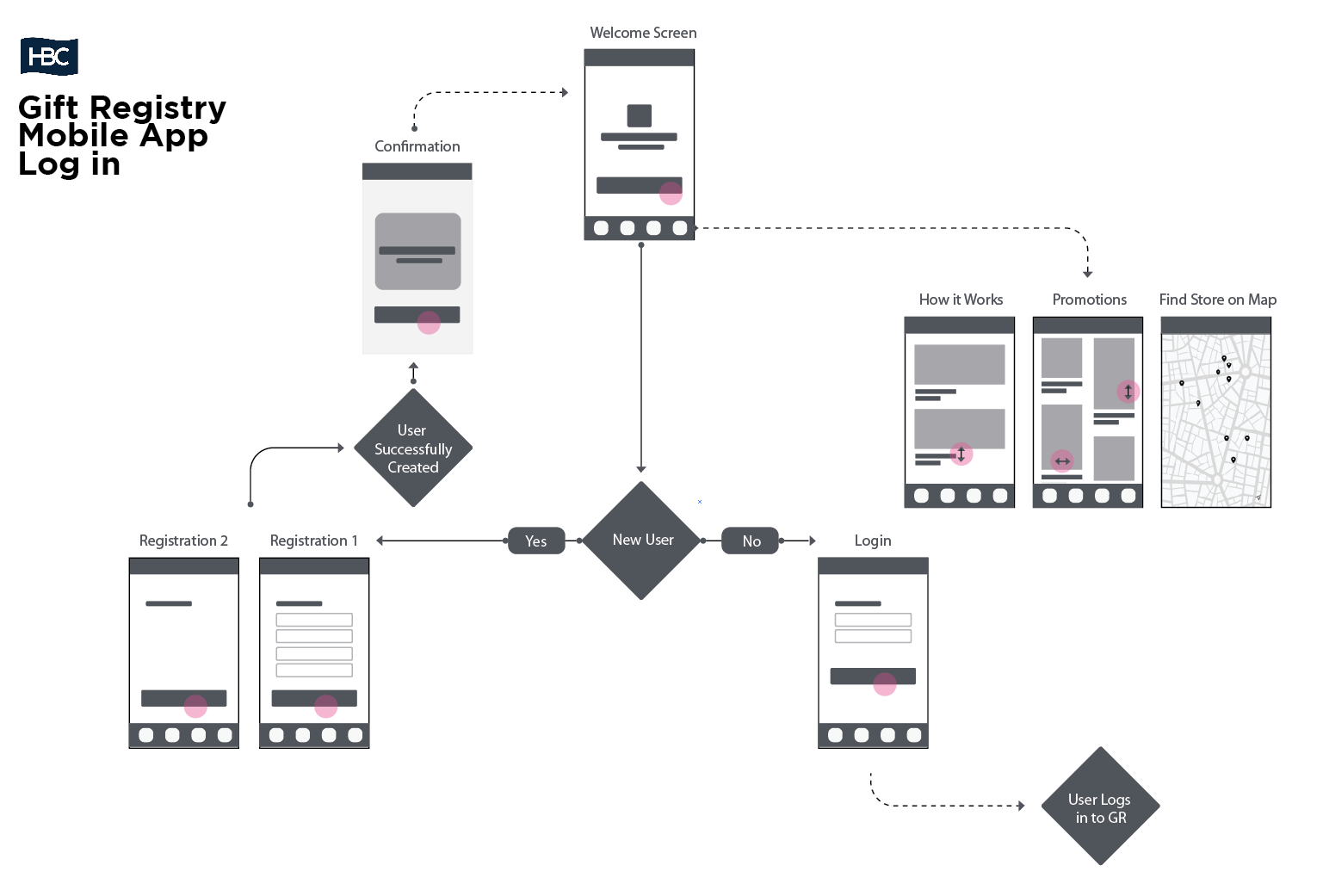
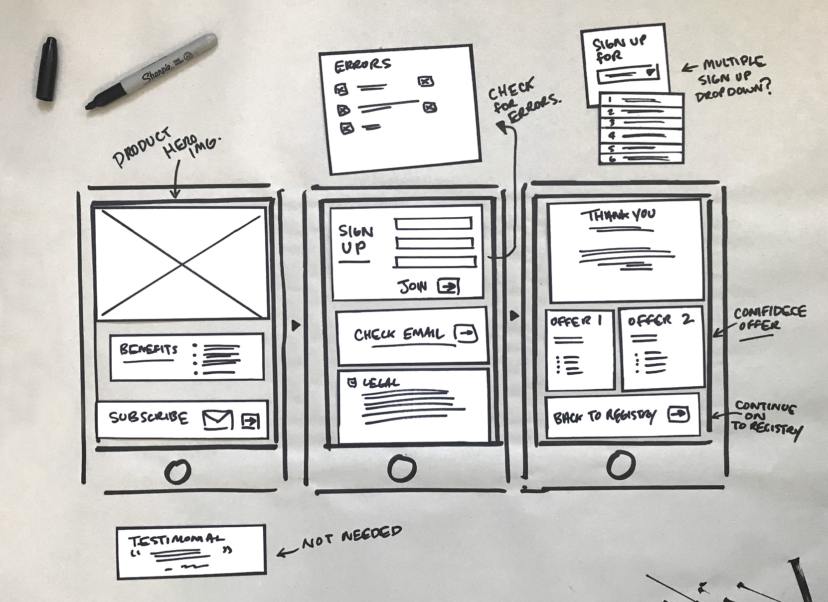
Initially low-fidelity wireframes were created to figure out how users would navigate from one page to another. Figuring out how to make the process as simple as possible would help quickly get users to register and get them excited to sign up and start the process of adding to their gift registry.

Prototyping and Testing
Problem Solving
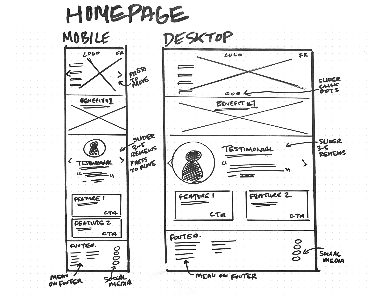
As the wireframes became more refined I started to create prototypes to help further understand and correct user flow. Building each navigational item out within a prototype solved many issues from form details to the user registry process. Once the prototypes were built I tested them with a small group women in my office aged 25-30 based in Canada, some were newly engaged and some were not. Early testing of these simple wireframes prototypes help debug many issues in the early exploratory phases.

UI Design
interaction and functioanly
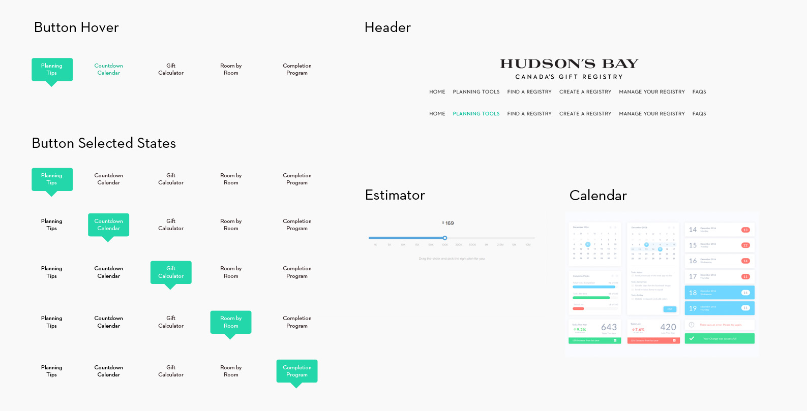
After gathering up testing results and revising the wireframes with the feedback I received, I soon began to create more final looking UI designs. Solving colour and imagery issues as well as interactive visual components such as buttons and navigational items. I then ran these more polished designs through a 2nd round of user testing and gathered more feedback which helped shape the site even further. Soon the site began to come together.

Conclusion
Insights
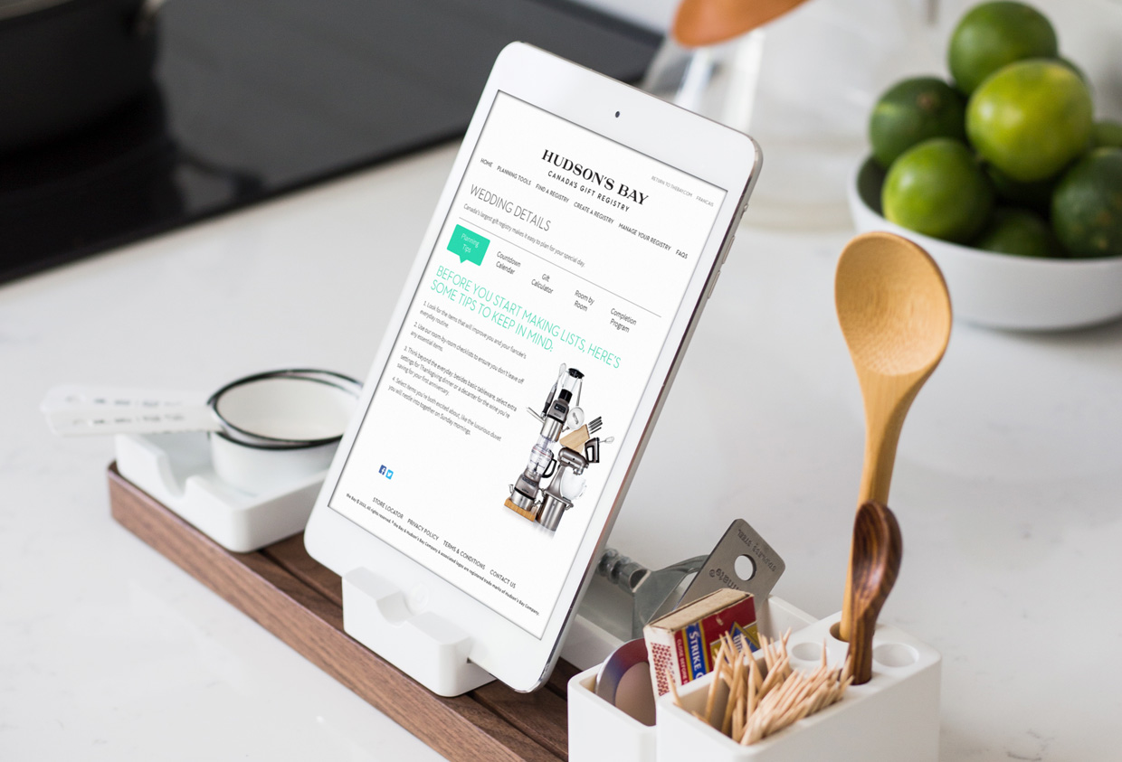
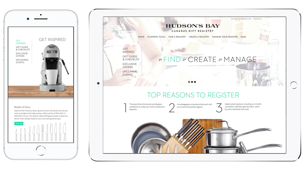
In the end, the final design was built to be fresh and clean. Photography was a key component to the site, showing off HBC's beautiful products was front and centre. As this site would be searched from anywhere, its framework was designed to be completely responsive so that it would work and be flexible on multiple devices.
